Civ 7’s Deluxe Edition has just hit the market, sparking a whirlwind of online discussions about its user interface (UI) and other perceived shortcomings. Is the backlash justified? Let's delve into the specifics of Civ 7’s UI and evaluate whether it's as problematic as some claim.
← Return to Sid Meier's Civilization VII main article
Is Civ 7's UI as Bad as They Say?
Civ 7, available only a day for Deluxe and Founder’s Edition buyers, has quickly drawn criticism for its UI and missing quality-of-life features. Rather than jumping on the bandwagon, it's crucial to take a closer look and evaluate the UI's effectiveness in the context of a 4X game. Let's break down the key elements of a good 4X UI and see how Civ 7 measures up.
What Makes a Good 4X UI?
The design of a 4X UI isn't one-size-fits-all; it must align with the game's specific context and objectives. However, experts have identified common traits among the best 4X UIs that generally contribute to an effective design. We'll use these standards to assess Civ 7’s UI.
Clear Information Hierarchy
A good 4X UI organizes information to highlight what's most important for gameplay. Essential data should be readily accessible, while less critical features should be easily reachable but not overwhelming.
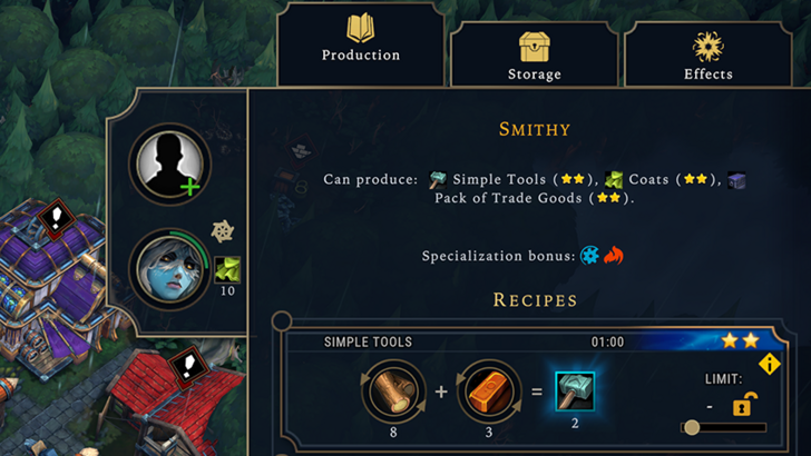
For instance, Against the Storm's building info menus exemplify this principle, with a well-organized pop-up menu that categorizes information by usage frequency.
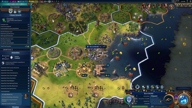
Turning to Civ 7's resource management UI, it does the job but could be more effective. It provides a comprehensive view of resource allocation across your empire, using dropdown menus to detail income, yields, and expenses in a tabular format. However, it lacks the detailed specificity needed to pinpoint resource origins at the district or hex level, and the breakdown of expenses is limited. While functional, more granularity would enhance its utility.
Effective and Efficient Visual Indicators
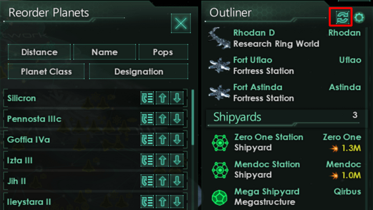
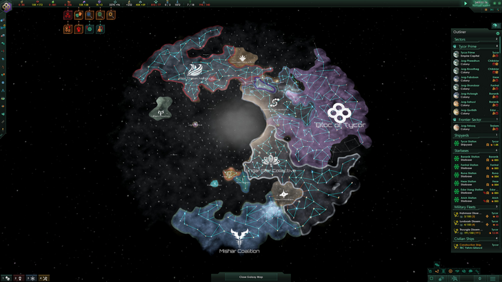
Visual indicators in a 4X UI should convey information quickly and intuitively. Stellaris's Outliner is a prime example, using icons and colors to communicate status at a glance.
Civ 7 employs iconography and numerical data for resources, supplemented by effective visual indicators like the tile yield overlay and settlement viability color-coding. Yet, it misses some of the visual lenses available in Civ 6, and the lack of customizable map pins has been a point of contention. While not terrible, there's room for improvement.
Searching, Filtering, and Sorting Options
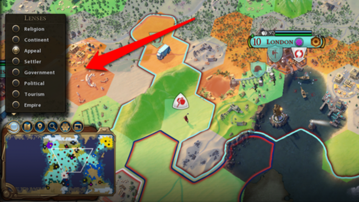
In complex 4X games, the ability to search, filter, and sort information is crucial for managing visual clutter. Civ 6's search function and Civilopedia links are exemplary in this regard.
Unfortunately, Civ 7 omits this search feature, which significantly impacts usability given the game's scale. This absence is a major flaw, and its addition in future updates could greatly enhance the UI's effectiveness.
Design and Visual Consistency
The UI's design and visual consistency are critical for player engagement. Civ 6's UI, with its dynamic cartographical style, seamlessly integrates with the game's aesthetic.
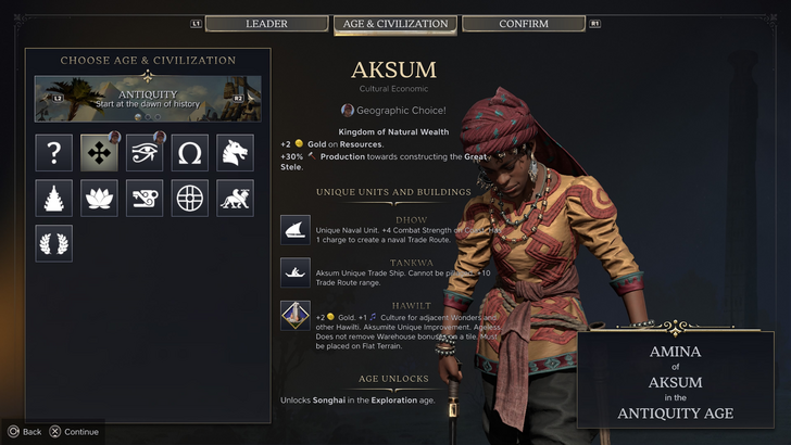
Civ 7 opts for a minimalist and sophisticated look, using a restrained color palette and simplified iconography. While this design aligns with the game's intended aesthetic of regality and refinement, it may not resonate as strongly with all players due to its subtlety. Visual design is subjective, but Civ 7's UI could benefit from more immediate visual clarity.
So What’s the Verdict?
It’s Not The Best, But Undeserving of Such Disapproval
After evaluating Civ 7's UI against these criteria, it's clear that while it has its flaws—most notably the lack of a search function—it isn't as disastrous as some critics claim. The UI's issues are overshadowed by the game's other strengths, and with potential updates and player feedback, it could improve significantly. Overall, Civ 7's UI, though not perfect, does not justify the level of criticism it has received.
← Return to Sid Meier's Civilization VII main article
Sid Meier's Civilization VII Similar Games

 LATEST ARTICLES