This article explores the evolution of Kirby's image in Western markets, revealing why the adorable pink puffball sometimes sports a more "tough" look. Former Nintendo employees shed light on the company's localization strategies and their impact on Kirby's branding.
The "Angry Kirby" Phenomenon: A Marketing Strategy
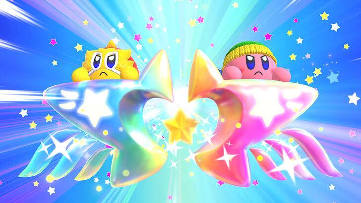
Kirby's Western portrayal often features a more determined, even fierce, expression—a stark contrast to his typically cute Japanese counterpart. Former Nintendo Localization Director, Leslie Swan, explains that while cuteness resonates universally in Japan, a tougher image was deemed more appealing to American tween and teen boys in the early 2000s. This wasn't about making Kirby angry, but conveying determination. Shinya Kumazaki, director of Kirby: Triple Deluxe, corroborates this, noting that while cute Kirby drives sales in Japan, a "strong, tough" Kirby resonates more in the US, although this varied by game.
Marketing Kirby as "Super Tuff Pink Puff"
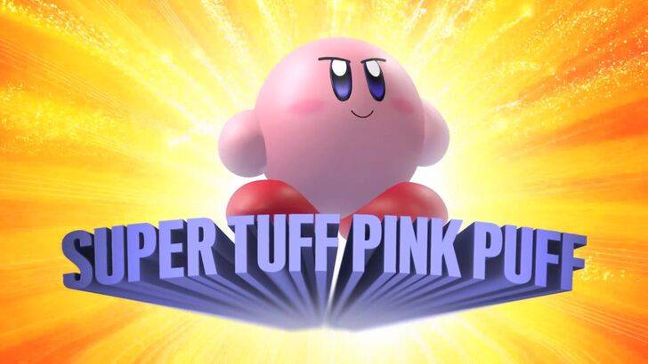
Nintendo's marketing actively aimed to broaden Kirby's appeal, particularly among boys. The "Super Tuff Pink Puff" tagline for Kirby Super Star Ultra (2008) exemplifies this. Former Nintendo of America Public Relations Manager, Krysta Yang, highlights Nintendo's desire to shed its "kiddie" image, recognizing the perceived negative impact of such a label. This led to a focus on Kirby's combat abilities in marketing, aiming to attract an older demographic. While recent marketing has attempted to present a more well-rounded Kirby, his cuteness remains his primary identifier.
Regional Differences in Localization
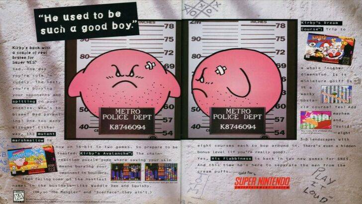
The divergence in Kirby's image between Japan and the US began early. A 1995 "Play It Loud" advertisement featuring a mugshot-style Kirby is a prime example. Subsequently, box art across titles like Kirby: Nightmare in Dream Land (2002), Kirby Air Ride (2003), and Kirby: Squeak Squad (2006) showcased Kirby with sharper features and a more serious expression. Even the color palette was altered; the original Kirby's Dream Land (1992) Game Boy release featured a desaturated Kirby compared to the Japanese version, a decision driven by the Game Boy's monochrome display and a perceived need for a tougher image to boost sales.
A Shift Towards Global Consistency
Both Swan and Yang agree that Nintendo has adopted a more global approach in recent years, fostering closer collaboration between its Japanese and American offices. This has resulted in more consistent marketing and localization strategies, minimizing regional variations in Kirby's portrayal. While this ensures brand consistency, it also risks homogenization, potentially leading to less culturally nuanced marketing. The increased familiarity of Western audiences with Japanese culture also plays a role in this shift towards global consistency.
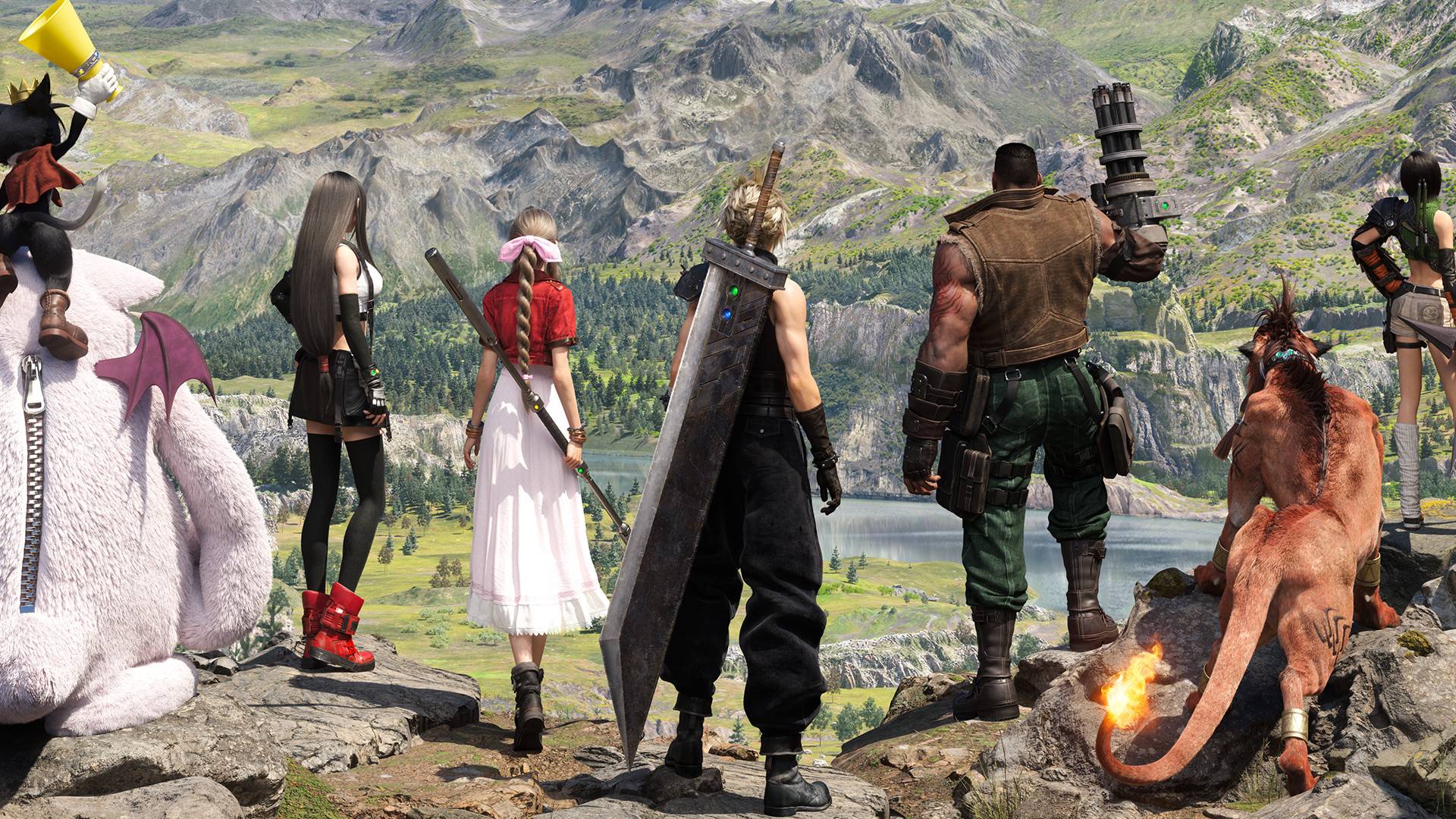
 LATEST ARTICLES